Readers may remember our reporting of a project to put new visitor info boards along the Goldfields Track. That was two years ago, and we’ve heard nothing till recently about the state of the project.
Now we believe that the plan is to put 80 information signs along the track between Ballarat and Bendigo.
FOBIF has expressed its interest in this project, and its two main concerns:
- That the signs tell the truth about the landscape we live in, and not wallow in heritage guff.
- That the track not be cluttered with signs. We believe the great charm of the track lies in its feeling of loneliness and abandonment. That feeling would be ruined by a plethora of signs telling people what to see.
Our concerns are not a criticism of the Goldfields Track committee, which is implementing the project.Our concerns are based on past experience with local signage. A good example is a board recently erected in the Walmer State Forest, part of which is shown here:
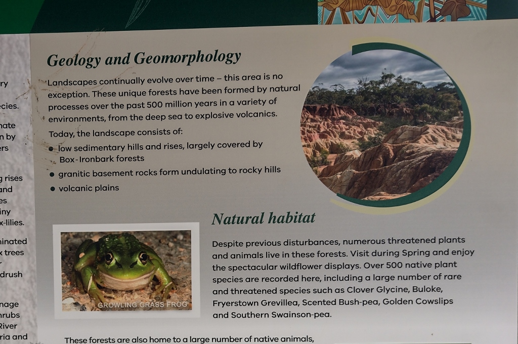
Walmer State Forest interpretation board: the geological information is wrong, and the photo has nothing to do with the text.
What’s wrong with the sign?
The main problem is that the photo is not of a sedimentary hill, granitic basin or volcanic plain: It’s of a sluiced and degraded area. Why can’t the text say so? It’s hard to resist the feeling that the author(s) would do anything to avoid saying, ‘Our natural landscape has been ravaged by gold seekers, and is slowly recovering.’
Interestingly, a nearby sign with info on Indigenous culture refers to our landscapes as ‘upside down country’–a phrase which perfectly sums up the facts. It’s a pity tourism promoters and heritage experts haven’t taken it on board.
There are other problems with the sign, but its evasion of the recent facts is the most obvious: to put it plainly, it’s misinformation. We’re hoping the Goldfields Track Committee doesn’t fall into the same error. We’ve strongly suggested that the authors of all future signage thoroughly consult Susan Lawrence and Peter Davies terrifying book, Sludge: disaster on Victoria’s goldfields. A few quotes from that book would fit well onto a signboard.


 Click on image for info/order page
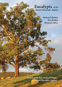 Click on image for info/order page
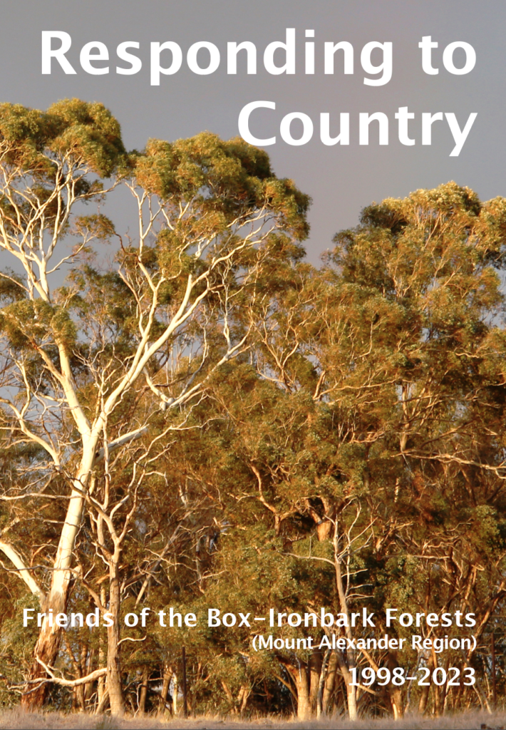
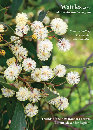 Click on image for info/order page
")


")


Agree re the signs, 80 sounds an awful lot. And the one you show above has very little actual information that we need, it’s mostly just chat.
There are too many signs in the world and they cost too much money. Less is more!